
Overview
The vibe of Kantina
Imagine a cozy corner where you might bump into an ambassador, a student, or even the mayor. Kantina isn't just any spot in town—it's the first to break the mold with its industrial style and a vibe that brings people together from all walks of life.
The challenge for us
Kantina wanted a marketing site that captured all of this: the food, the cocktails, the people, and the vibe. The goal? Let potential guests feel the warmth of the place even before stepping foot inside.
And it had to be easy to navigate, no fuss, and no over-the-top marketing—just simple, direct, and cool, like Kantina itself.
My contribution
Product strategy
User research
Product design
The team
3 × ux/ui designers
1 × engineer
Year
2022
Process
it's all about data
We kicked things off by diving deep into the details. The first step was UX research—going through Kantina’s brief with a fine-tooth comb to understand exactly what they wanted. But that was just the beginning. We gathered all the data we could find, from scouring online reviews to asking the client more targeted questions to fill in any gaps.
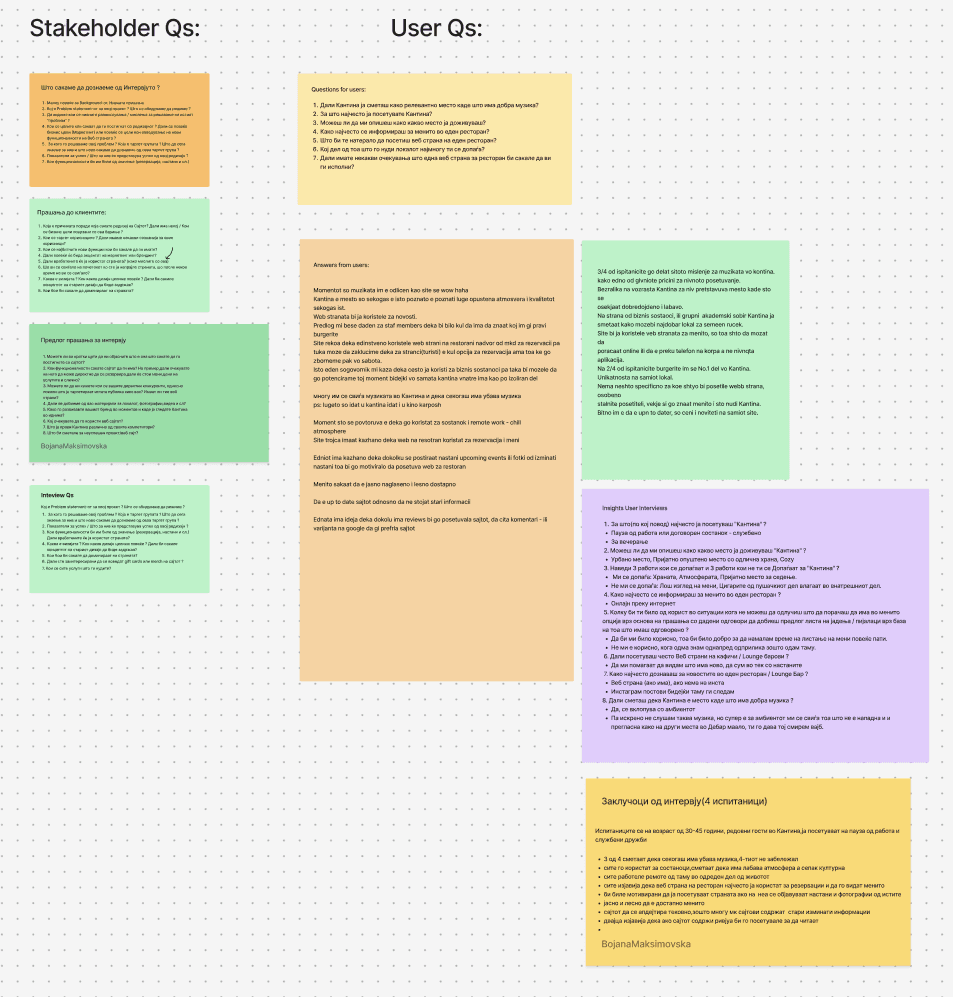
asking the customers
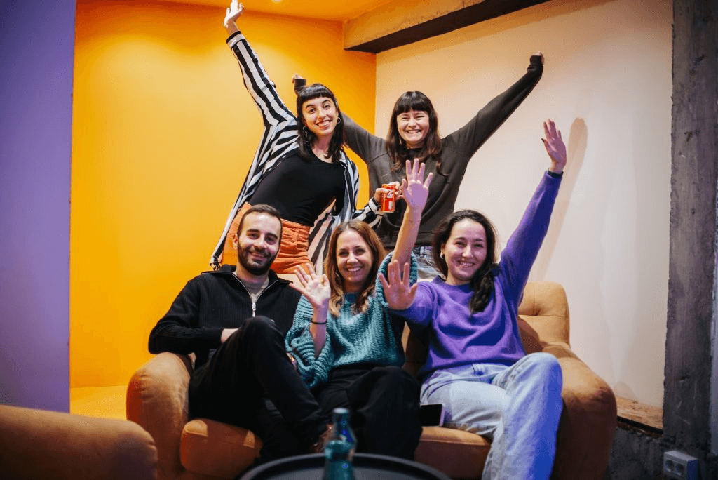
To really understand what makes Kantina special, we spoke to real people—the folks who dine there and the staff who keep it running. We went down to the restaurant and talked with the team to understand their pain points and potential challenges. What’s working? What could be smoother? Where do customers get stuck?

pain points & opportunities
Next, we mapped out user personas and journeys, defining who Kantina’s visitors were, what they loved, and where they might run into issues. From there, we spotted key opportunities and possible pain points to address in the design. This phase of research was crucial in figuring out how we could craft unique features that enhanced the experience for both staff and customers.

the visual brainstorm
Before diving into the design, we took a step back for some visual brainstorming. The goal was to capture Kantina's unique atmosphere through colors, textures, and styles that felt right. We started by creating moodboards, pulling together inspiration from industrial designs, cozy lighting, and diverse, lively environments.
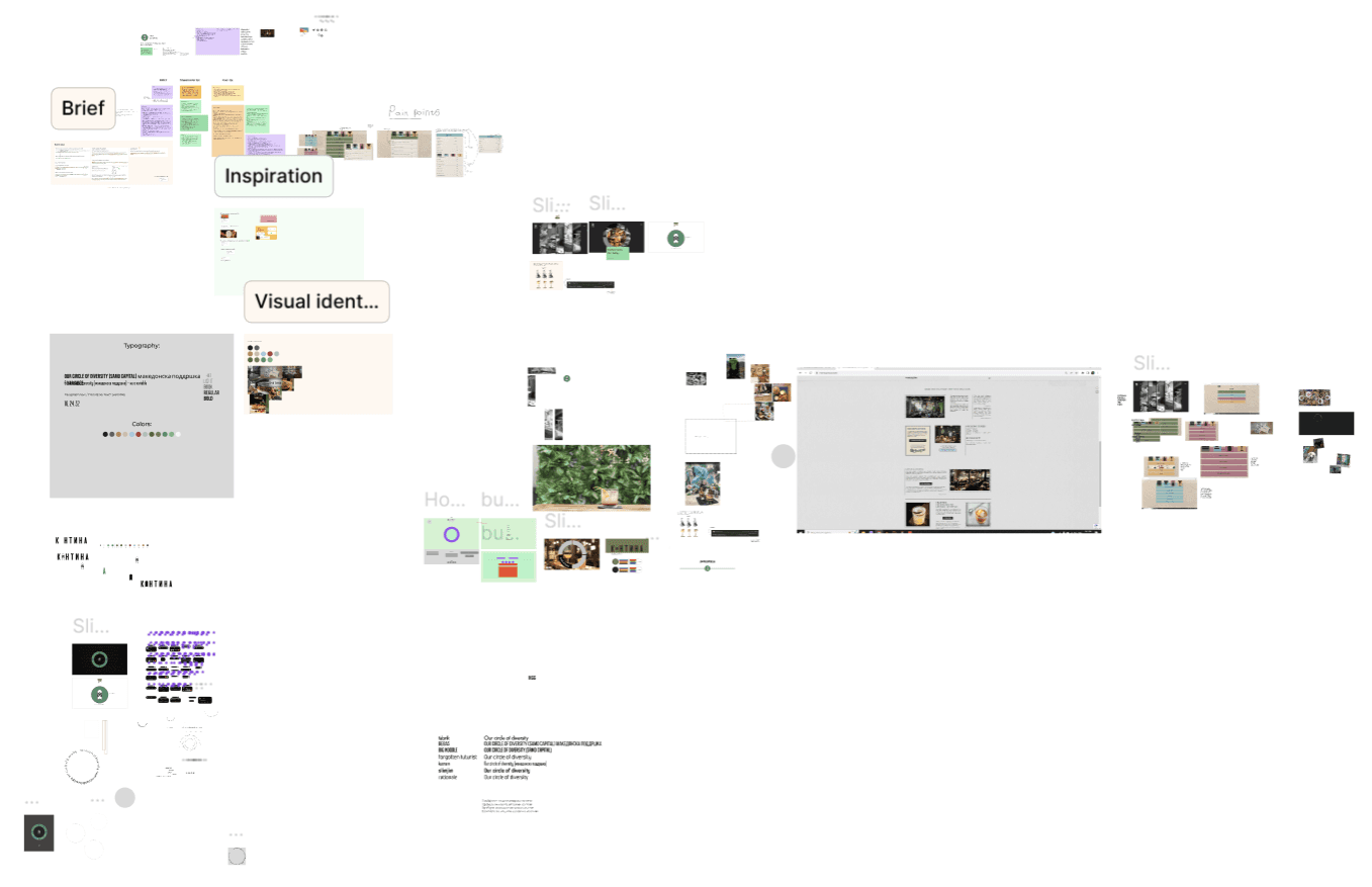
it all started with the circle
We wanted a shape that represented inclusion, continuity, and balance—everything Kantina stands for. The circle became our central element, symbolizing the diverse mix of people coming together in one space.
Once the circle was defined, it gave us a strong base to build on. We used it to structure key parts of the layout, ensuring the visuals felt consistent and aligned with Kantina’s core message of diversity and inclusion.

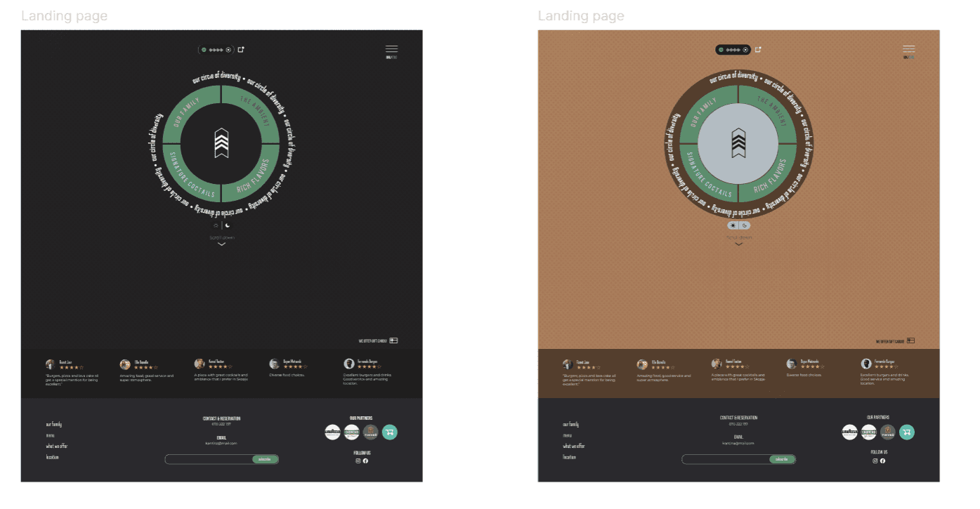
interactive Landing Page
Kantina didn’t have a clear or accurate online representation that showcased everything the restaurant stands for.
Visitors couldn’t get a true sense of what Kantina offered, leading to a disconnect between the physical and online experiences.
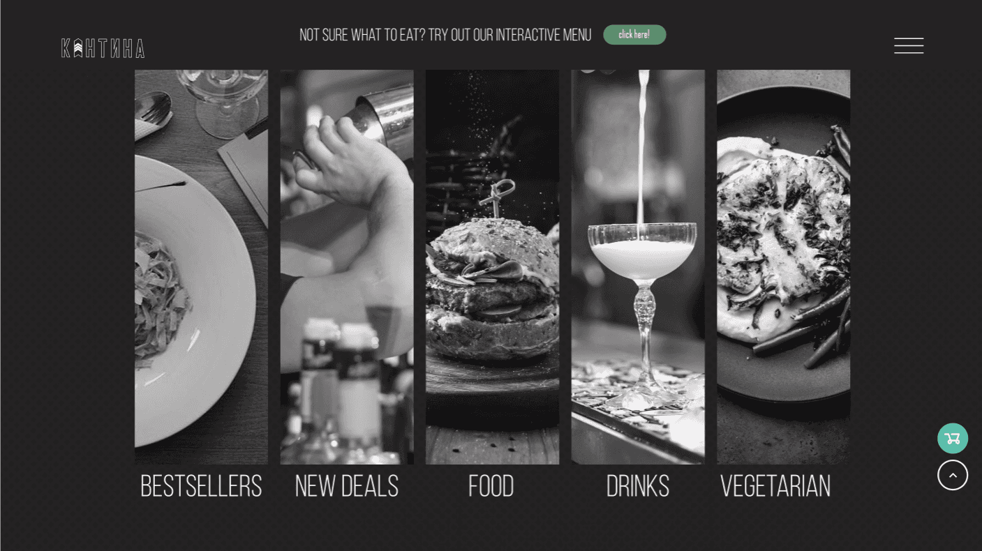
We designed an interactive circle on the landing page, divided into four key categories*,* which bring all the essential elements of Kantina together in one place—its people, the vibe, the drinks, and the food.
the Menu
Kantina’s existing menu was cluttered and difficult to navigate, with no clear structure and limited variety. Customers had trouble finding what they were looking for, with fewer options for vegetarians.
Special attention was given to including more vegetarian options and clearly labeling them, ensuring that the menu catered to a wider range of dietary preferences.
the Interactive Menu
In a competitive restaurant scene, Kantina wanted to provide users with a memorable and delightful experience that would set its website apart from other restaurants.
Users are guided through a series of fun and engaging questions about their meal preferences—such as dietary restrictions, favorite flavors, or cravings—and are then offered personalized recommendations from the menu.

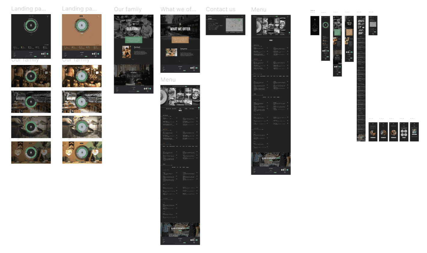
responsive design
Kantina's previous online presence was limited to a mobile-first menu, leaving desktop users without a fully functioning website.
Whether users are browsing on a desktop or mobile, the site adapts perfectly, offering a smooth, custom-crafted design for each view.
Outcome
The Kantina project was an exciting, fast-paced journey where we had just 48 hours to design a website that captured the heart of this unique restaurant. Kantina’s slogan, "We embrace diversity," inspired us to create a digital space that brings together its eclectic clientele and showcases everything the restaurant stands for.